OP.GG ADJUSTMENT
The process behind streamlining OP.GG's web experience.

ABOUT OP.GG
OP.GG is a website well known in the game community (specifically League of Legends, or LoL) to be the premier website for checking in-game statistics.
The website features live game updates, integration with in-game accounts, and numbers on everything related to LoL, from the characters you play as, to the players themselves.
MY ROLE
I conducted background research, planned out interviews, created the wireframes, and designed the final addition.
THE PROBLEM
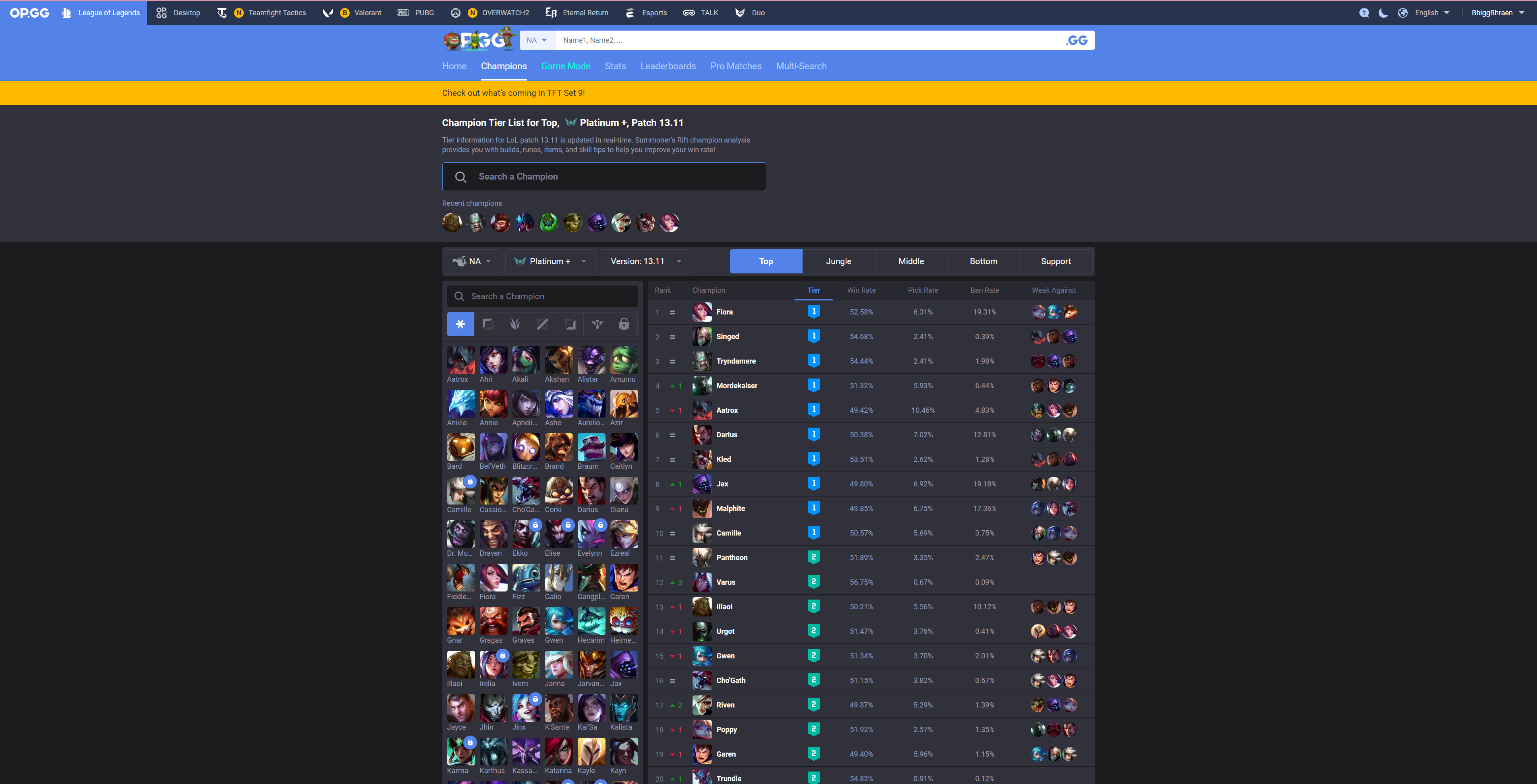
While OP.GG hosts a wide array of numbers and statistics, the information architecture is confusing, and the high-priority information doesn't stand out.
RESEARCH
Out of the 10 players surveyed, 9 of them reported interacting with the website under time-sensitive conditions (between games, picking characters).
The interaction time given these conditions are short, so information presented must be easily accessible.
DELIVERABLE
I kept time-sensitivity and clear information architecture in mind when I designed this frame. It condenses the spreadsheet of information into clear sections, with high priority information front and center. The lower priority items are hidden within drop down menus and tabs, allowing those who want more information to continue through the website. Adding this frame ahead of the previous one would improve overall user flow of the website.
CONCLUSION
OP.GG has great information, and has been a trusted data source in the LoL community since 2012. With my 12 years of game experience, I appreciate how much information OP.GG packs into their website. Their website is overall very reliable, and doesn't need much improvement. However, I think this small addition would greatly improve the quality of life for amateurs and veterans alike.